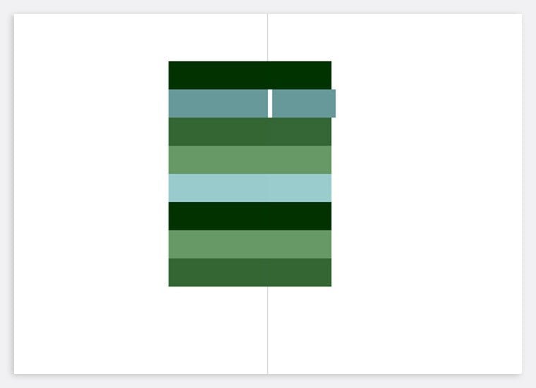
I’ve been exploring play and discovery as principles of interaction design for a long time. My first online portfolio in 2000 presented site visitors with only a single, striped monolith with no visible interactions.

Given no obvious prompts, users will move their mouse around the browser window. On this site, the stripes fracture when hovered over, suggesting a new visual structure to be uncovered.
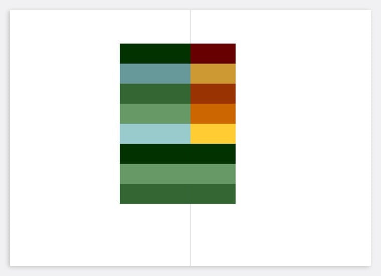
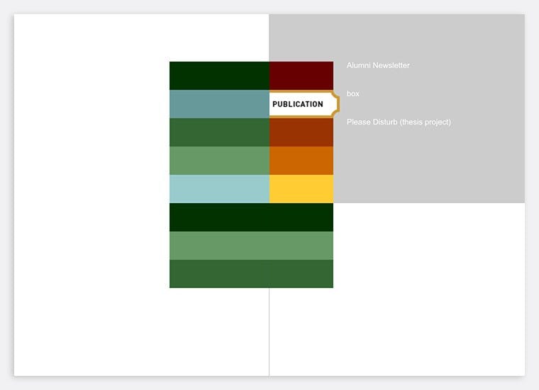
Clicking further reveals the underlying grid which is composed of 4 quadrants: navigation, project details, project images, and contact info. The interface is a puzzle that unfolds through use, fostering curiosity which encourages deeper observation and discovery. As an experiment, users came away either frustrated or intrigued.
Current interaction and interface design rewards those in a hurry; those who see information but don’t interpret it; those who consume quickly and remember little. But what if interface could initiate new questions, foster unintended connections, provide meaningful resistance, and adapt functionality, as well as serve deeply personal and universal needs at the same time?
The Real Uninsured
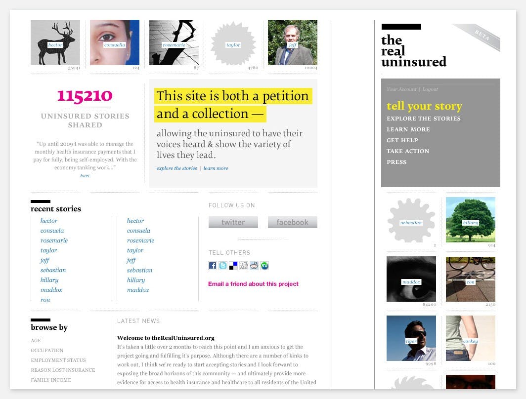
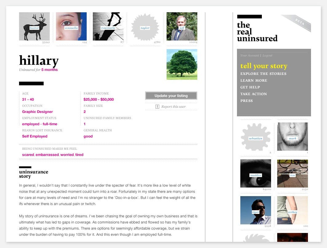
To advocate for universal healthcare coverage, I wanted to demonstrate the need for insurance and the impact of not having it. A petition is a simple interface that quickly shows how little or how much a group cares about an issue. A handful of signatures resonates as much as many pages of signatures but in a different way. By seeing how full the form is, interest in the issue is communicated.
At first glance, the Real Uninsured appears either empty or full. An empty site could be a catalyst for participation or clearly demonstrate a lack of interest. An overflowing site could illustrate urgency and drive.

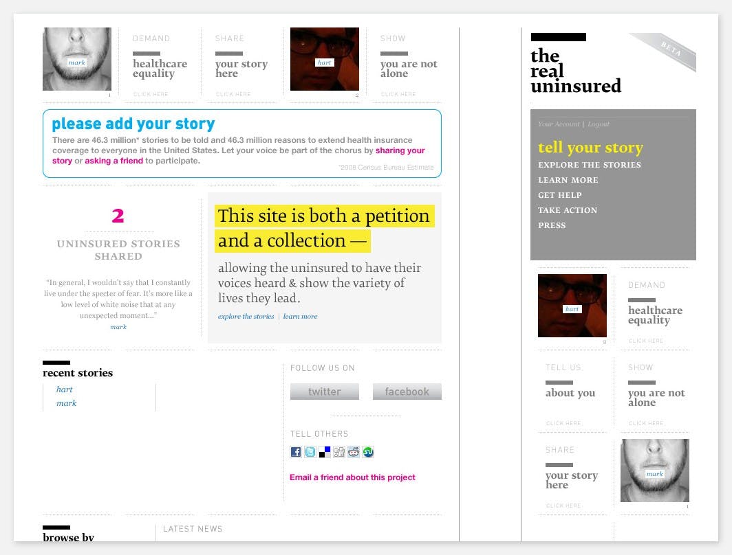
To expand the effect of a petition, the site encourages signers to add their story about being uninsured. They can also add other quantitative and qualitative information. By seeing other stories, signers are shown they are not alone. Impact is added to the names.
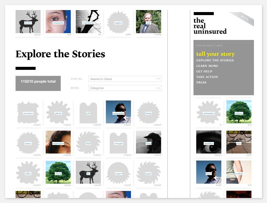
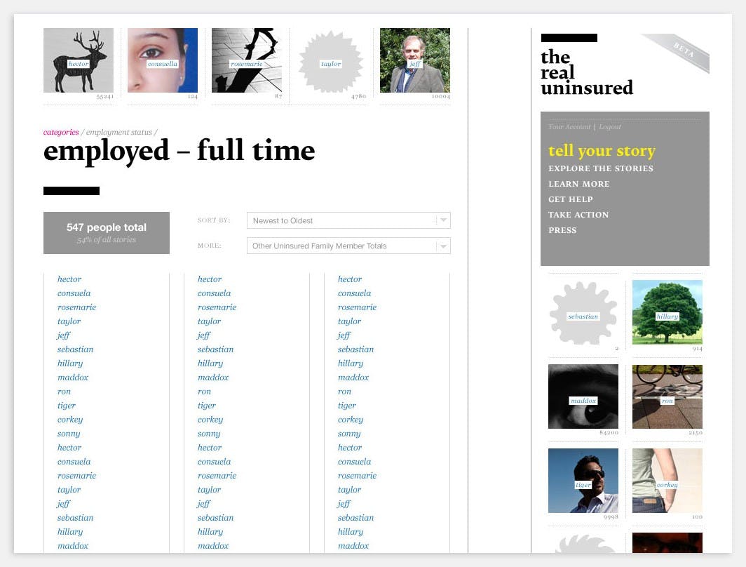
The Real Uninsured was designed as an open-source framework that could be implemented for any issue or cause. It is an interactive experiment in interface as activism, identity, and community.
msanders.media
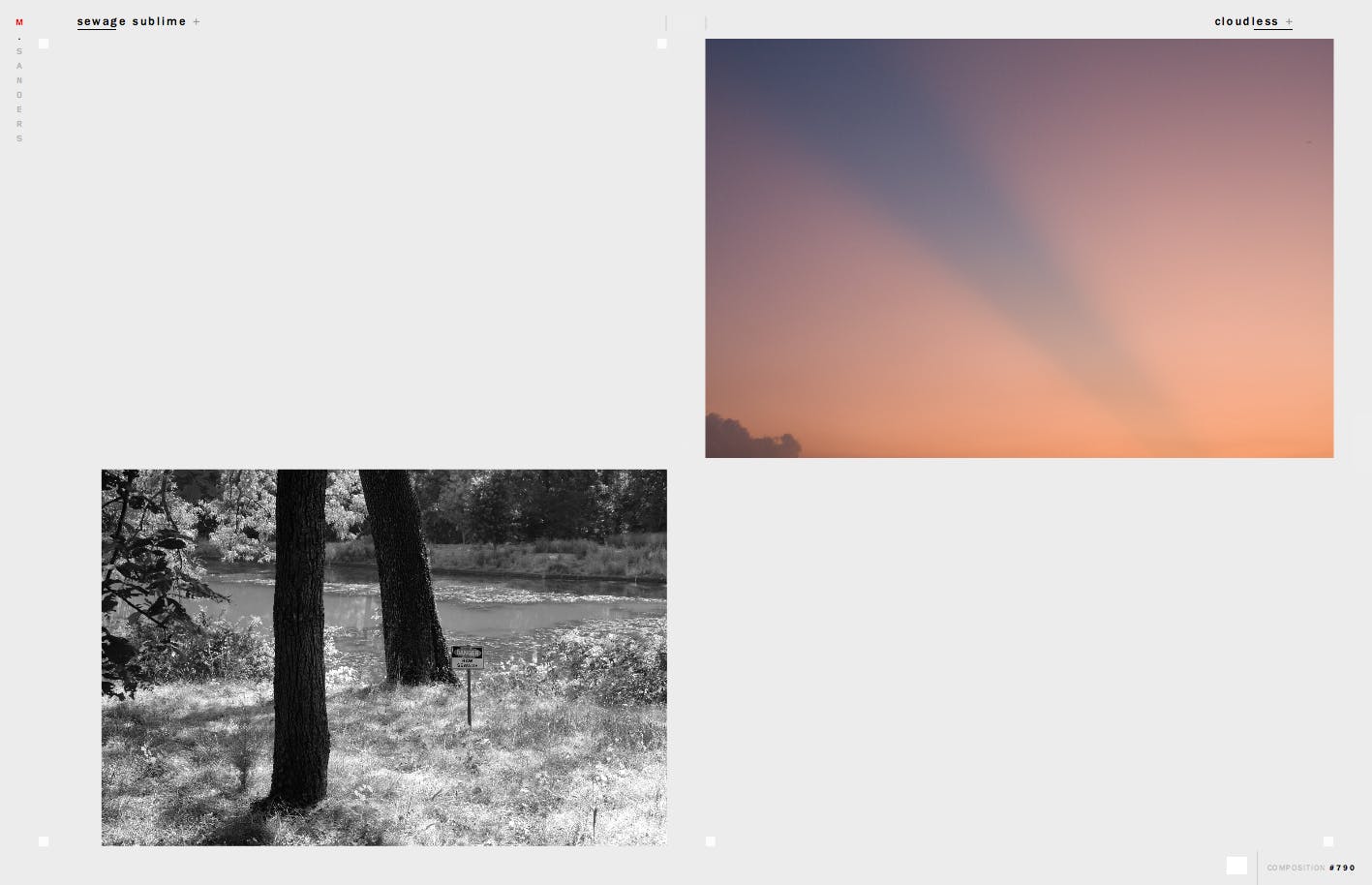
Collections are challenging to select and curate and doing so can lead to both joy and frustration. As a longtime photographer, I revel in making images. I love exploring and interpreting place visually. I hate reviewing and processing photos.
There are plenty of online tools for sharing and curating image collections. Upload, add a title and description, add tags, and maybe include the collection in a group. The fundamental interface for this type of site is a linear grid of images—a sequence. As a designer, I know sequence is vitally important to narration and communication and what comes next and what comes before tells a story. Because of this, I labored over which image made sense in the sequence. And with a very large collection, earlier photos were often located on a different page which I never saw. Yes, tags could help link themes, but creating categories that can adapt to a growing collection is daunting.
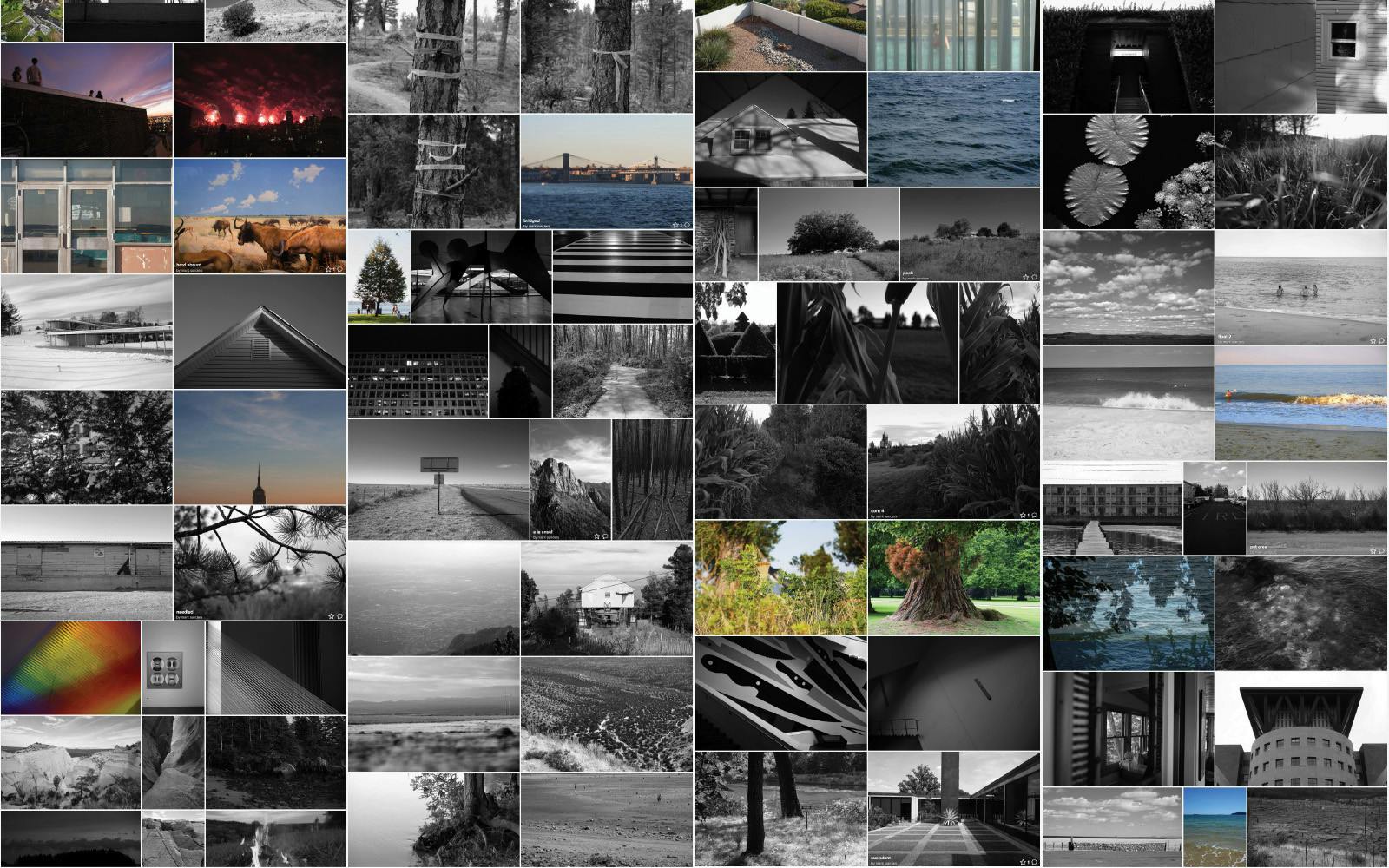
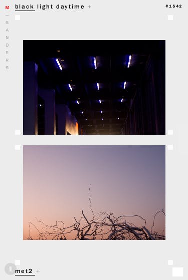
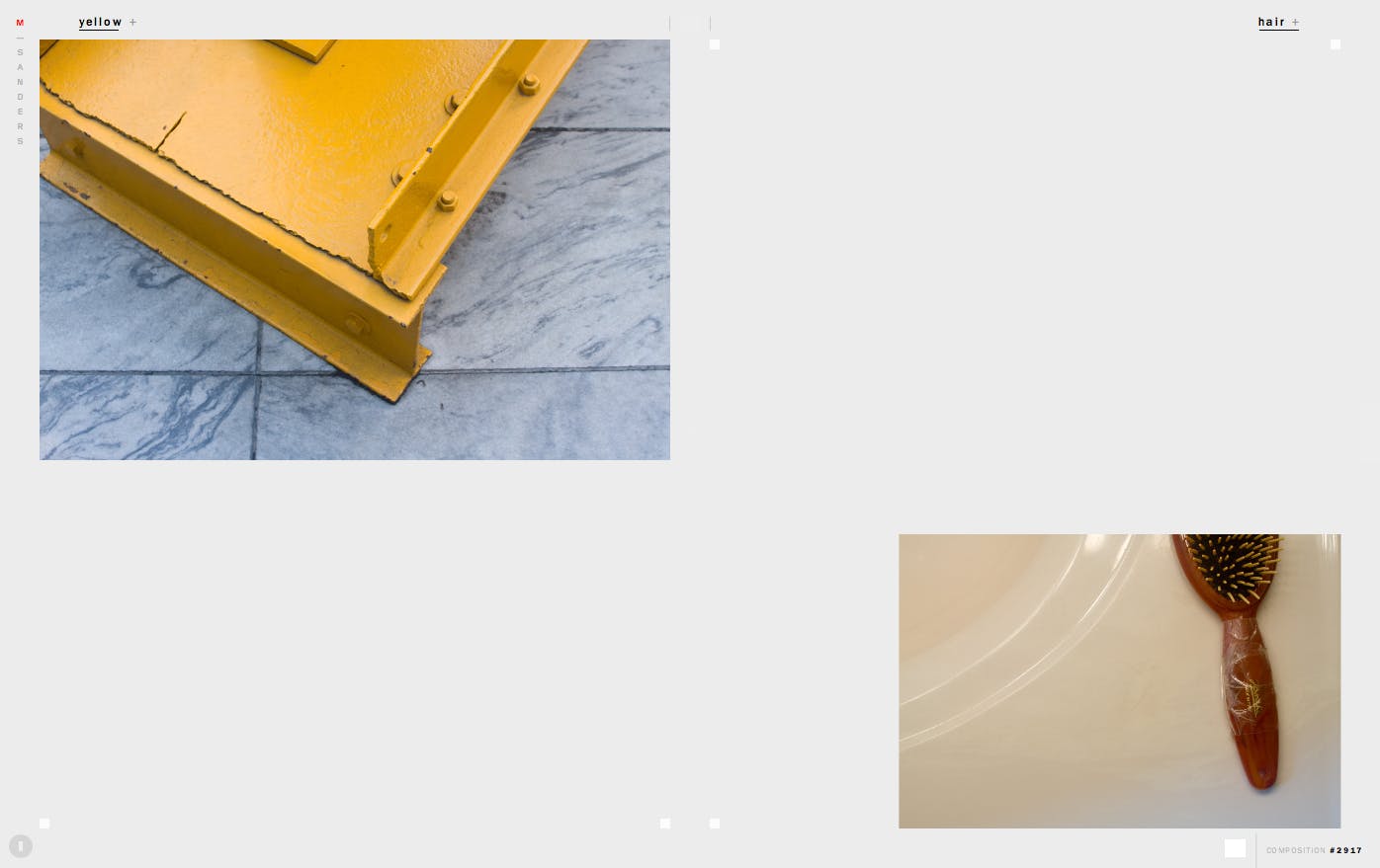
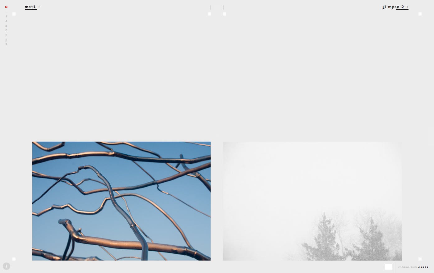
Flickr’s linear grid
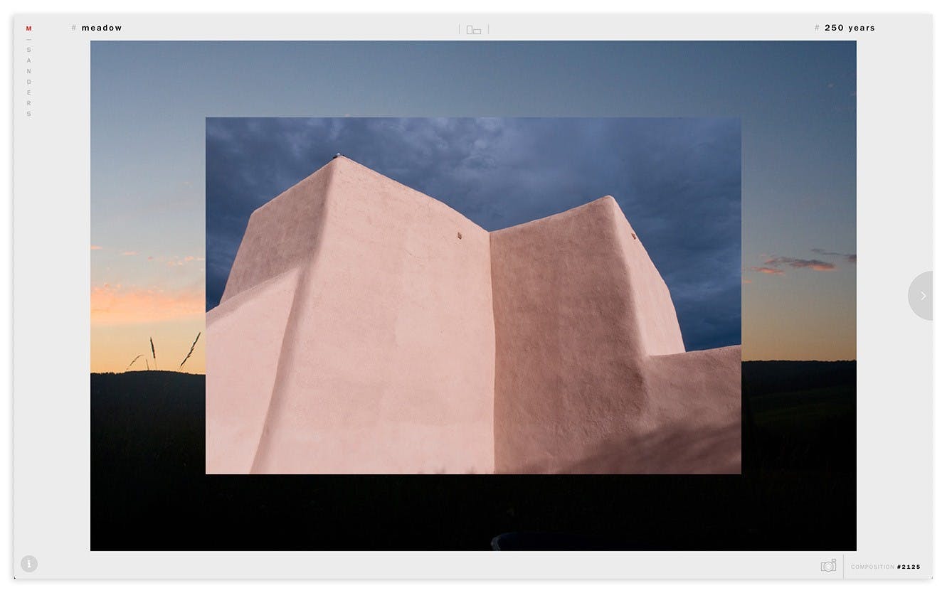
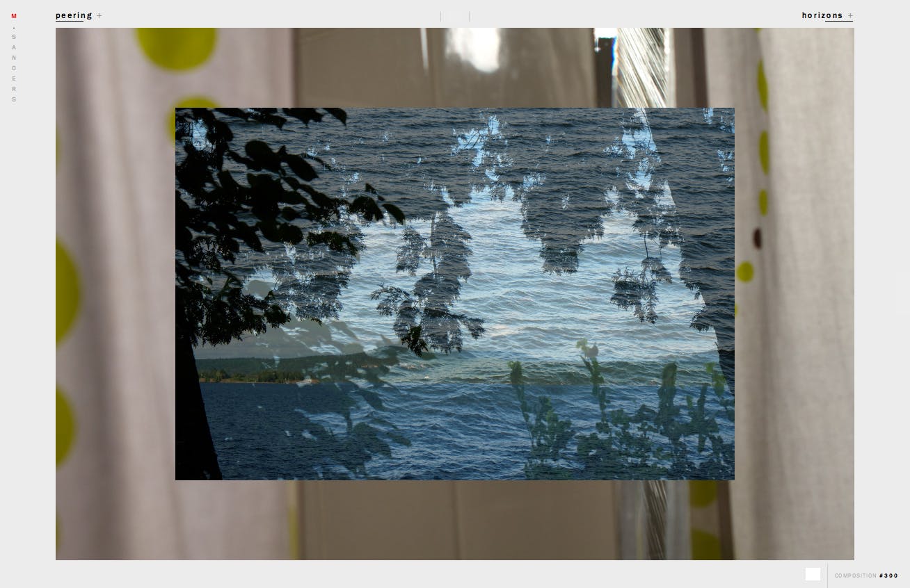
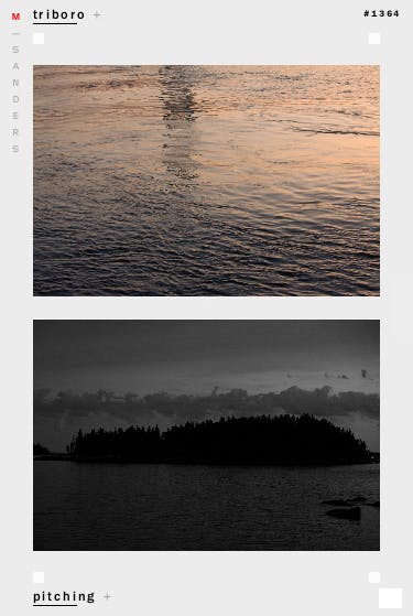
To break the linear sequence, msanders.media simply combines two random images from my Flickr feed in a large window. Presented as a diptych, a new serendipitous objective and subjective connection is made each time the page is loaded. The size of the images are randomly determined, too. The simplicity of the page layout invites comparison. Sometimes there is no relationship, but often a composition, a character of light, a theme, a focal point, or something else is shared. The more images that are added to the collection and the more the interface generates diptychs, the more connections are made.

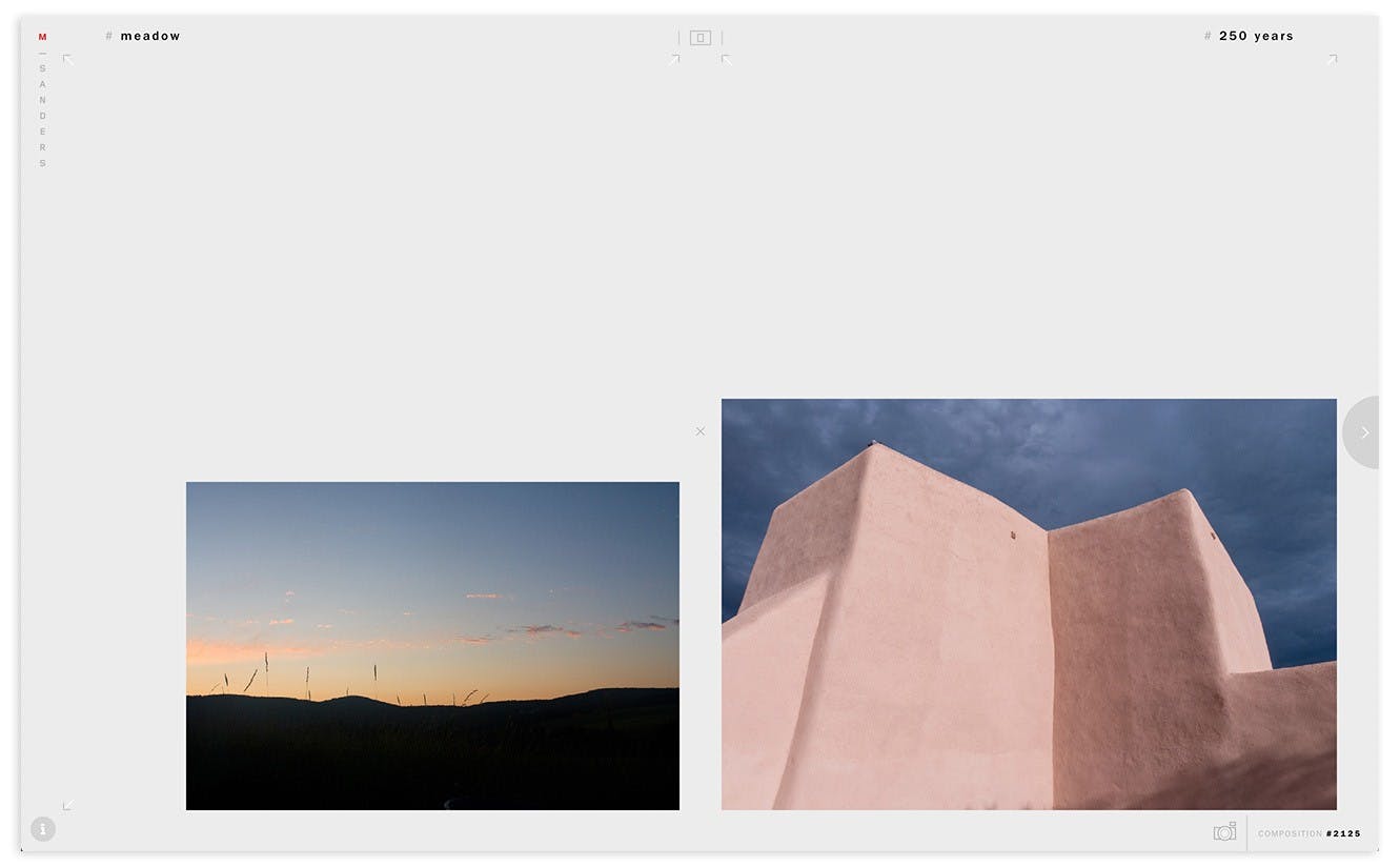
Another aspect of msanders.media is flexible composition. Two images are always loaded—one on the left and one on the right—yet any site visitor can change where they are positioned. The site also allows images to be stacked on top of each other for an entirely different page layout. Customizable composition acts as another form of curation by allowing the user to reinforce or diminish the formal connections between photos by placing them in different positions.
The site’s page layout mirrors a common design for photography monograph books. Clicking the ‘camera’ button captures a screen grab of the browser window preserving the size and placement of the image pair for future viewing.

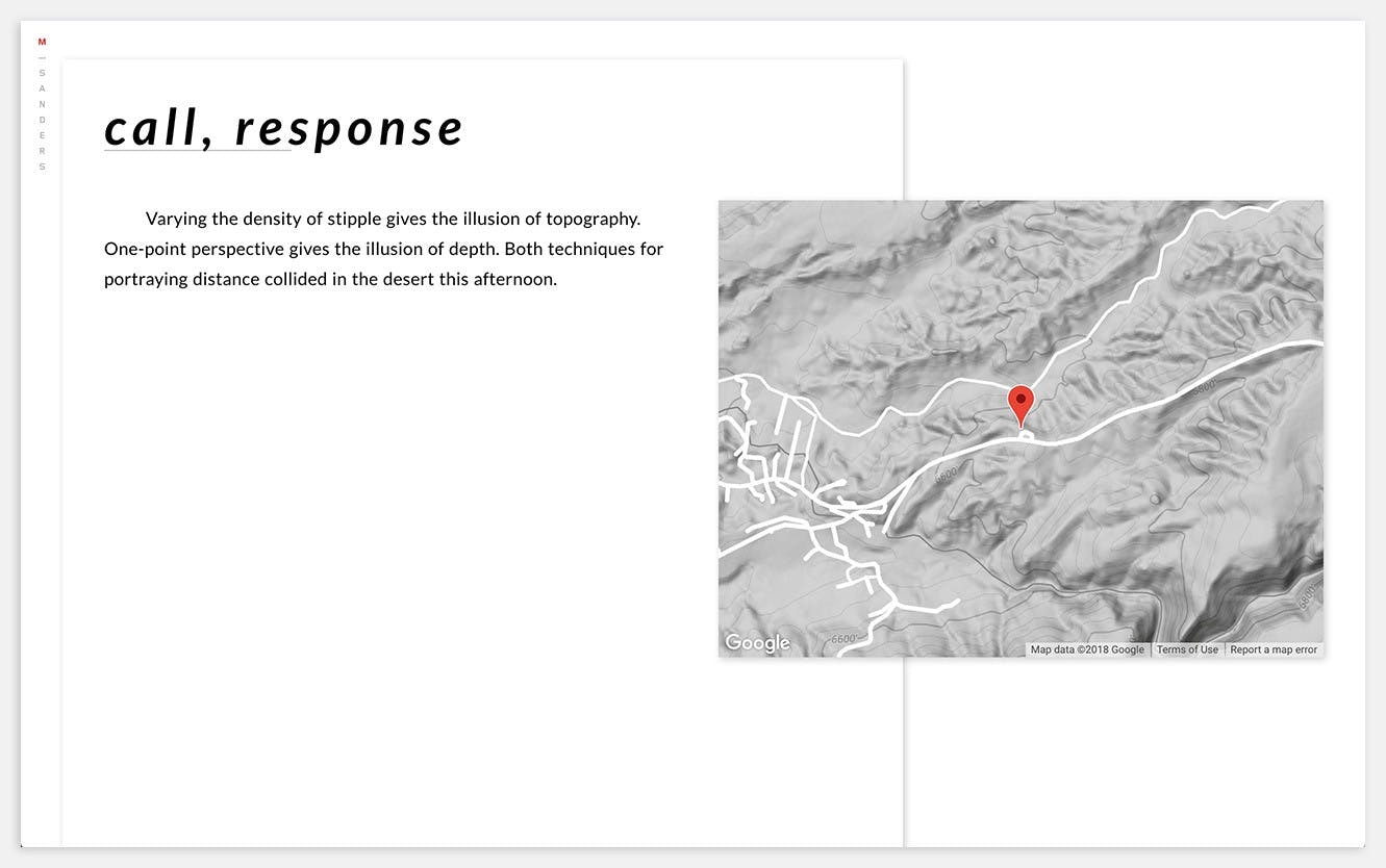
Since much of what I photograph is in pursuit of recording memory and place, the narrative that inspires each image is important to capture, too. This accompanying text is more in-depth than a caption or title. After the site launched, I added a place for notes and location of each image.
This experimental interface has lowered my anxiety of adding new images to the collection. It has also helped me identify visual and conceptual themes that I explore more deeply with current and future image making.


.png?ixlib=gatsbyFP&auto=compress%2Cformat&fit=max&w=1299&h=830)